博文
利用R一键画表达量箱线图并添加显著性
||
参考CSDN博主「TS的美梦」的“复现《NC》图表(二):R语言一键画表达量箱线图并添加显著性”(原文链接:https://blog.csdn.net/qq_42090739/article/details/121911002)利用自己数据进行了尝试。
#加载需要的R包:
library(RColorBrewer)
library(ggpubr)
library(ggplot2)
library(cowplot)
#加载数据并进行处理:
func<-read.csv("function-FN.csv", header=T, row.names=1)
#选择几个基因做数据
gene<-c("aerobic_ammonia_oxidation", "aerobic_nitrite_oxidation", "nitrification", "chloroplasts", "manganese_oxidation", "predatory_or_exoparasitic")
gene <- as.vector(gene)
#数据标准化
func <- log2(func*100+1)
#提取需要作图得基因表达信息
func_plot <- func[,gene]
#加载分组信息
info<-read.csv("treatments.csv", header=T)
func_plot <-func_plot[info$Samples,]
func_plot$Samples=info$Treatments
func_plot$Samples <- factor(func_plot$Samples,levels=c("CK","F","N","FN"))
#设置分组颜色
col <-c("#5CB85C","#337AB7","#F0AD4E","#D9534F")
#循环绘制每个变量图
plist2<-list()
for (i in 1:length(gene)){
bar_tmp<-func_plot[,c(gene[i],"Samples")]
colnames(bar_tmp)<-c("gene","Samples")
my_comparisons1 <- list(c("CK", "F"))
my_comparisons2 <- list(c("CK", "N"))
my_comparisons3 <- list(c("CK", "FN"))
my_comparisons4 <- list(c("F", "FN"))
my_comparisons5 <- list(c("N", "FN"))
my_comparisons6 <- list(c("F", "N"))
pb1<-ggboxplot(bar_tmp,
x="Samples",
y="gene",
color="Samples",
fill=NULL,
add = "jitter",
bxp.errorbar.width = 1,
width = 0.8,
size=0.3,
font.label = list(size=20),
palette = col)+theme(panel.background =element_blank())
pb1<-pb1+theme(axis.line=element_line(colour="black"))+theme(axis.title.x = element_blank())
pb1<-pb1+theme(axis.title.y = element_blank())+theme(axis.text.x = element_text(size = 15,angle = 45,vjust = 1,hjust = 1))
pb1<-pb1+theme(axis.text.y = element_text(size = 15))+ggtitle(gene[i])+theme(plot.title = element_text(hjust = 0.5,size=15,face="bold"))
pb1<-pb1+theme(legend.position = "NA")
pb1<-pb1+stat_compare_means(method="t.test",hide.ns = F,
comparisons =c(my_comparisons1,my_comparisons2,my_comparisons3,my_comparisons4,my_comparisons5,my_comparisons6),
label="p.signif")
plist2[[i]]<-pb1
}
#分列排布
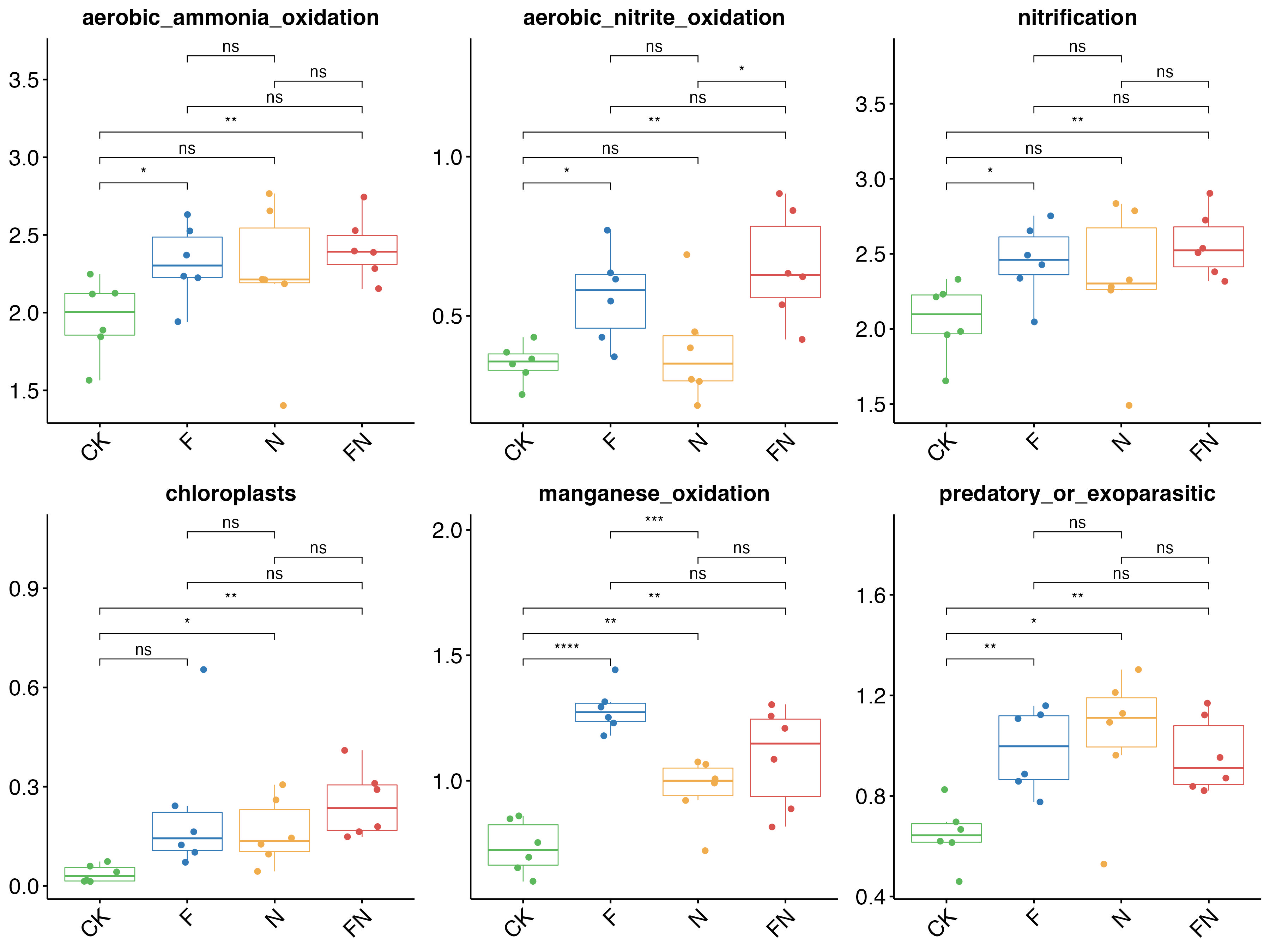
pall<-plot_grid(plist2[[1]],plist2[[2]],plist2[[3]],plist2[[4]],plist2[[5]],plist2[[6]],ncol=3)
#图片保存
ggsave(pall,filename = "FN.jpg",width = 12,height = 9)
#结果如下图所示
https://m.sciencenet.cn/blog-2675068-1356000.html
上一篇:简化lefse图流程
下一篇:相关性散点图